Deep Dive 01
Auto Loan Tracker
What you talkin' 'bout — balance? Reimagining the Capital One auto loan experience to help customers understand where they stood and prevent end-of-loan surprises.
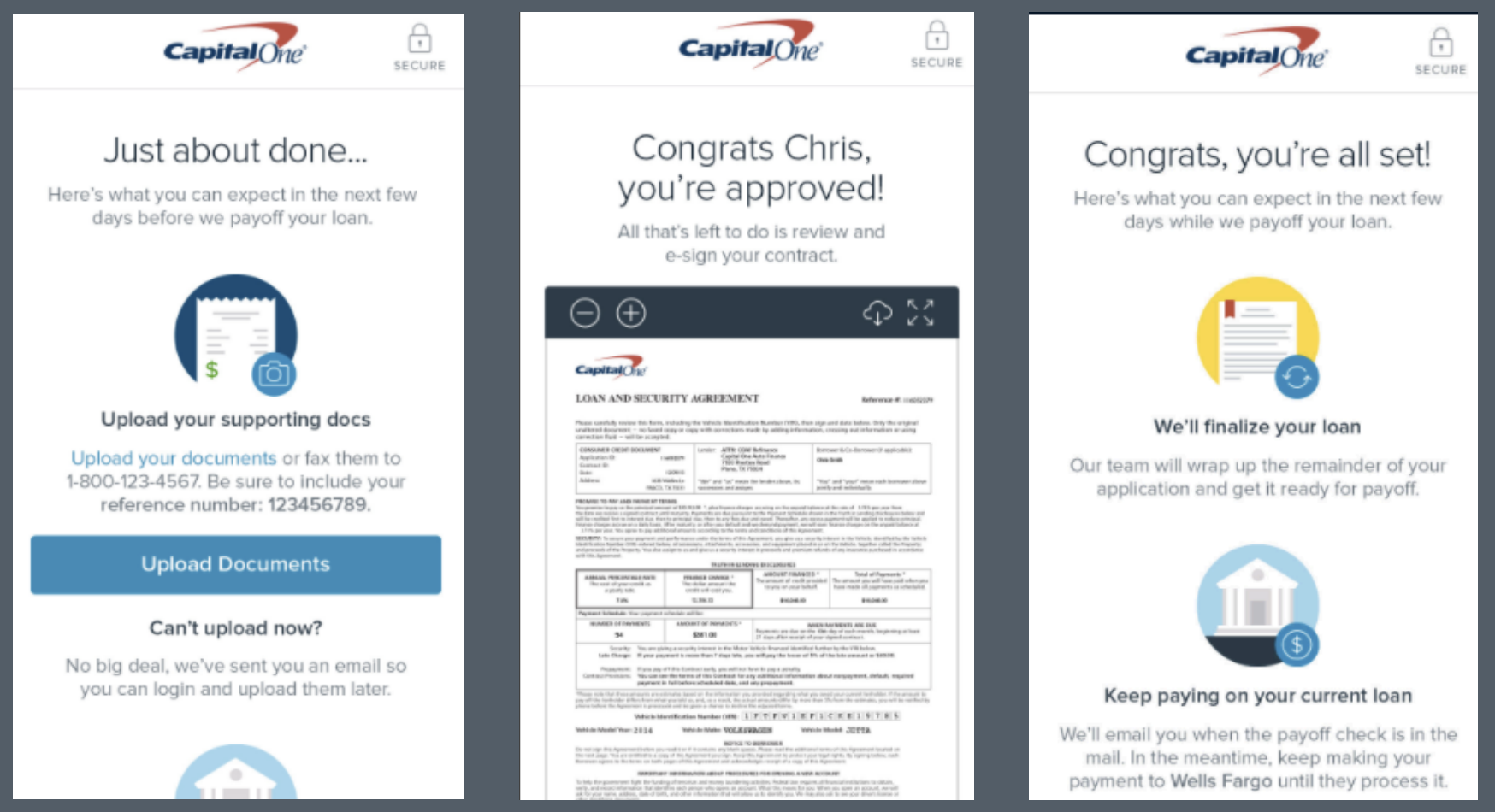
Users who paid late on their Capital One auto loans could end up with an unexpected balance at the end of their loan term — money that was rarely recovered and created a terrible customer experience. The ask: help users understand where they stood with their loan and stop the end-of-term surprise before it happened.
The Problem
- User confusion — Customers didn't understand how simple interest loans worked, leading to late payments and surprise end-of-loan balances.
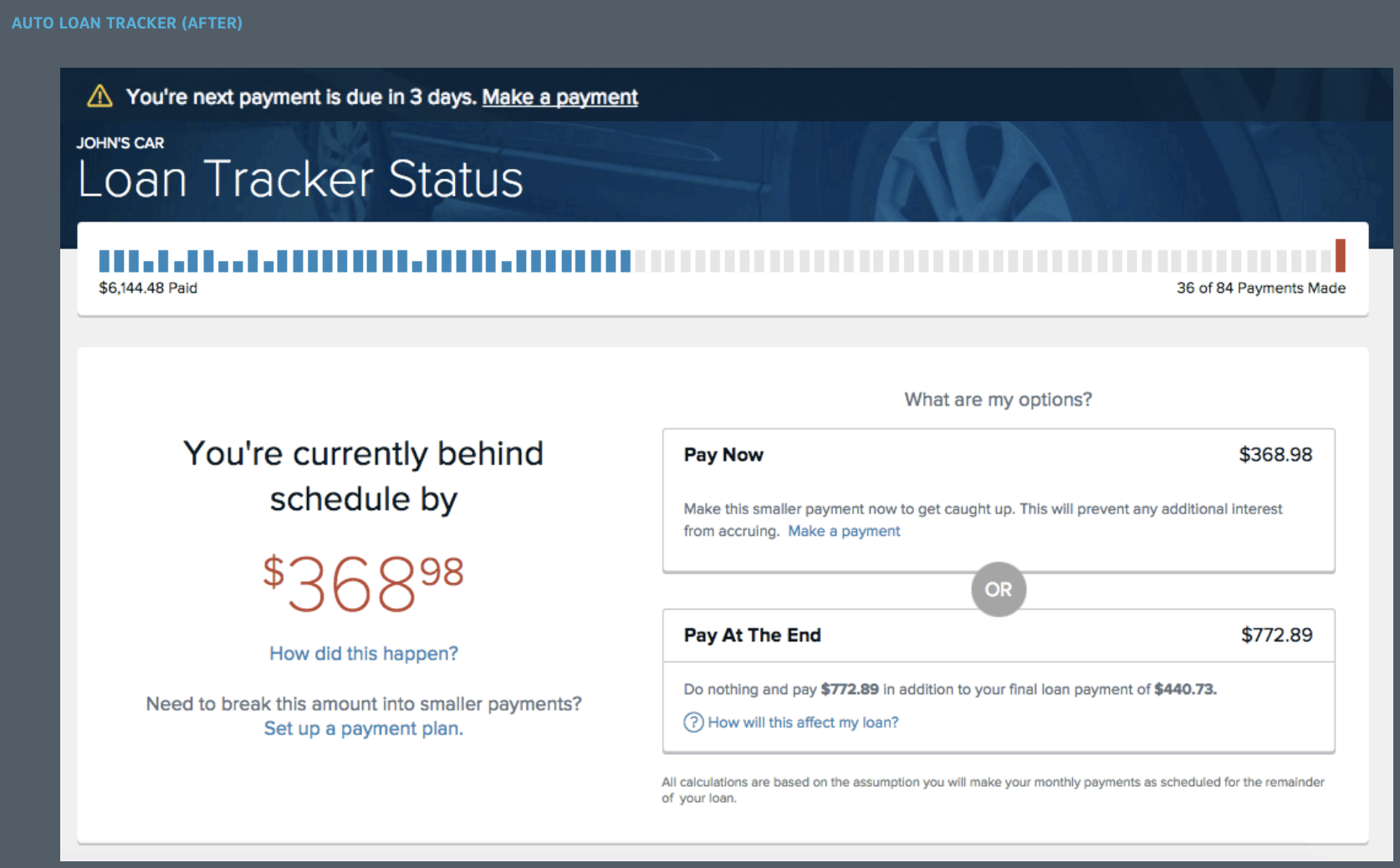
- Clunky experience — The existing tracker was confusing, long-winded, and lacking empathy for customers who were behind.
- Business impact — Unpaid end-of-loan balances meant lost revenue and lost future customers.
My Process
- Gain insight — Empathy research, market research, user testing, and baseline content testing to understand the real problem.
- Define the problem — Research analysis, needs analysis, and "How might we…" questions to frame the opportunity.
- Define the audience — Who are our customers? What do they like, hate, need, and fear? What makes them tick?
- Content audit — Assessed what we were currently communicating: was it empathetic, clear, and contextually relevant? Did it follow the three principles — Natural Language, Contextually Relevant, Use Case Specific?
The Strategy
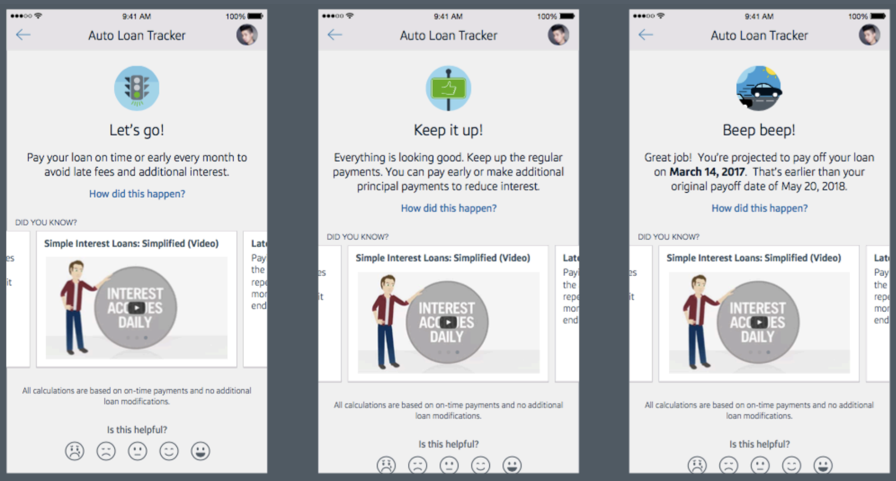
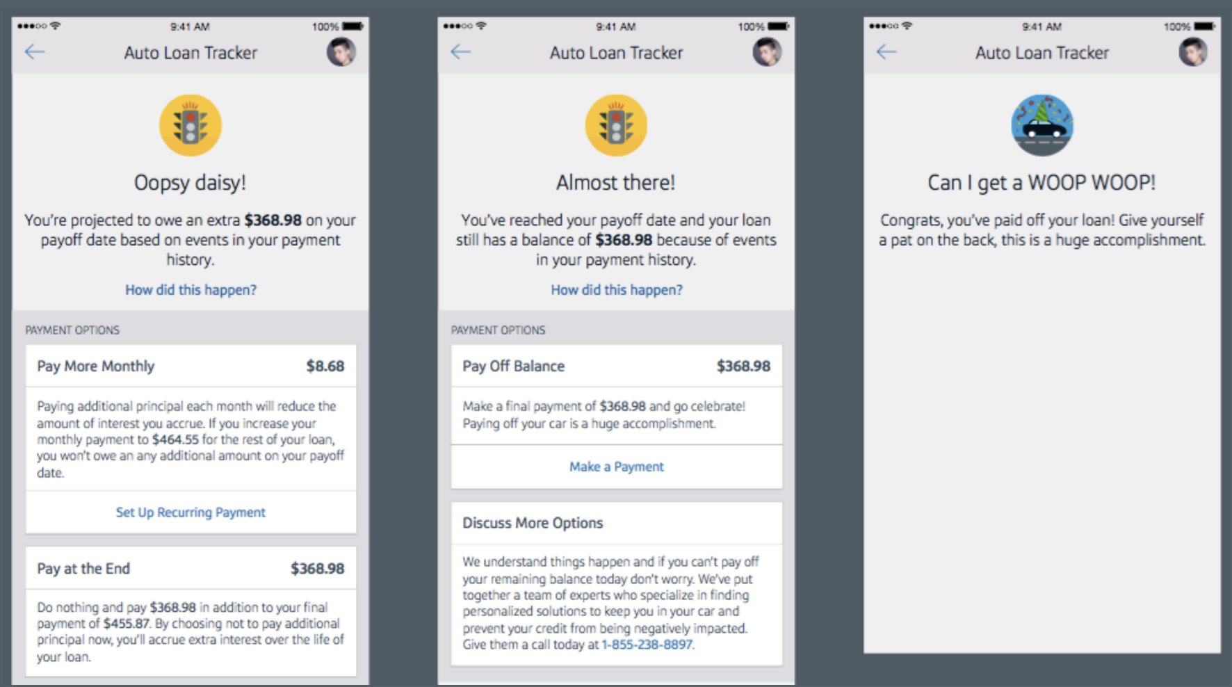
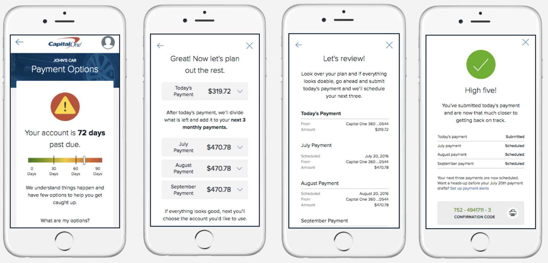
- Reimagine the entire experience — New user flows, new UI, new interaction treatments, and entirely new content.
- Know / Feel / Find / Act framework — Built a content framework to ensure every message answered what users needed to know, how we wanted them to feel, what they were looking for, and what we wanted them to do.
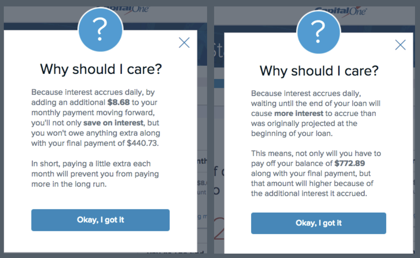
- Empathetic language — Rewrote all content to be warm and encouraging when customers were ahead, and clear and supportive when they were behind — never shaming.
- Simple interest education — Created an explainer video and in-app tips to help customers understand how their loan actually worked.
The Result
- 15,000 customers paid ahead at least 2 months within the first 3 months.
- 11% decrease in call center volume.
- 80,000 new on-time customers added to the books.
- 5-point NPS bump — and glowing customer feedback.
"I love the advice about paying the loan off." / "I love that I can see my 10-day payoff on the app!" / "WOOP WOOP... PAID IN FULL."
Deep Dive 02
Feedback Tracker
From generic surveys to targeted insight: Redesigning how Capital One collected customer feedback — then scaling the heck out of it.
Capital One was collecting feedback — but not the right kind. Responses were generic, lacked context, and couldn't be tied to any specific feature. The ask: build a targeted feedback system for a new mobile feature, use it to quickly address customer concerns and reduce call volume, then scale it across the product.
The Problem
- Low-quality feedback — Users were providing little feedback, and what they did share lacked enough context to act on.
- No feature attribution — Couldn't tie feedback to specific parts of the product, making it impossible to prioritize fixes.
- Survey fatigue — Existing NPS questions were long, clinical, and easy to ignore.
The Strategy
- Content audit first — Analyzed the existing NPS questions for clarity, empathy, and relevance before designing anything new.
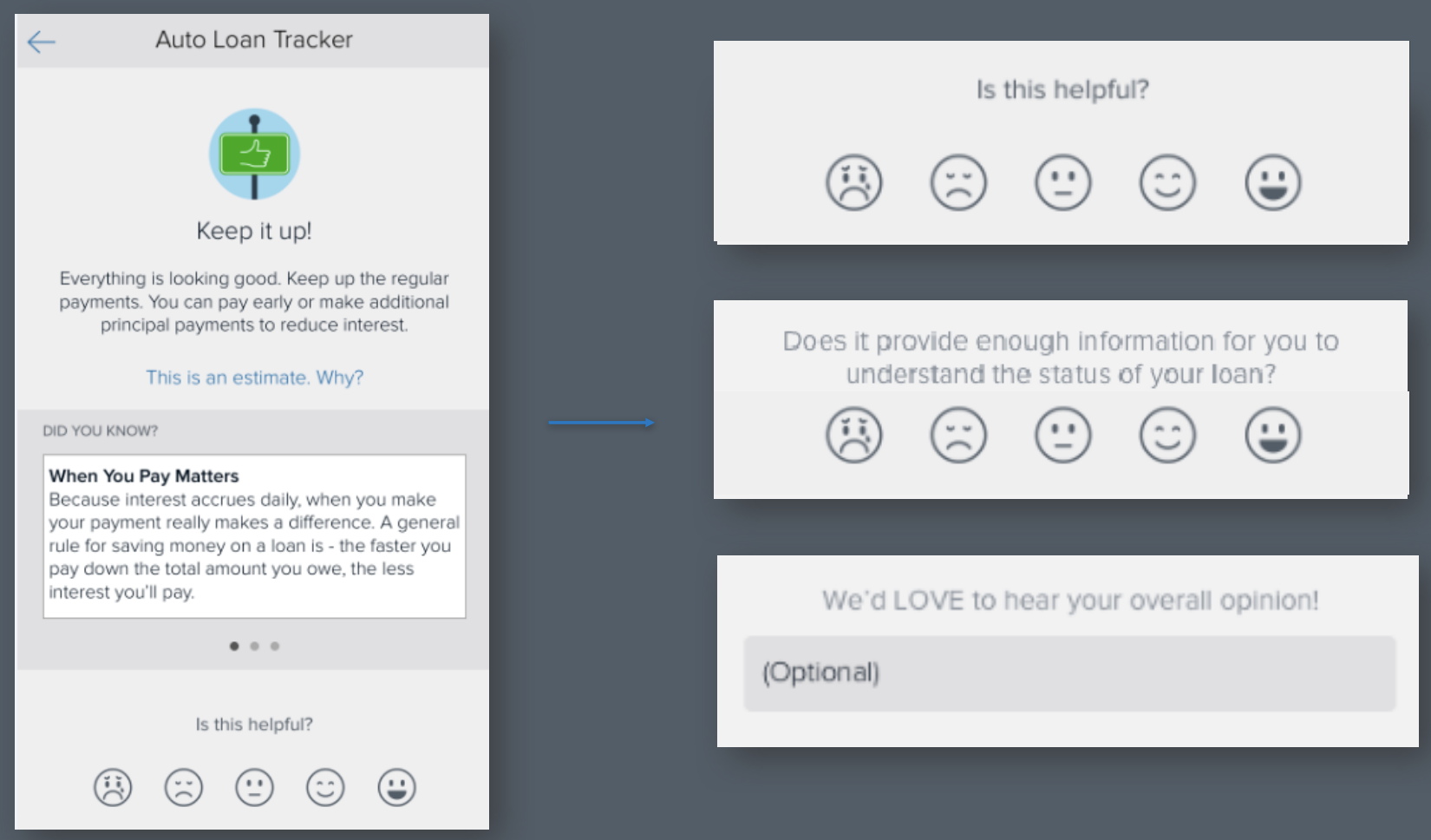
- Contextual triggers — Designed feedback prompts that fired at the right moment in the right feature, so responses were always tied to a specific experience.
- Conversational language — Rewrote survey copy using natural, human language that felt like a quick conversation rather than a formal questionnaire.
- Scalable system — Built a reusable feedback framework that could be dropped into any feature — then scaled it across the product.
The Result
- Higher response rates — Contextual, conversational prompts dramatically increased the volume of usable feedback.
- Actionable insight — Product teams could now tie specific feedback to specific features and make faster, data-driven decisions.
- Scalable blueprint — The framework became the standard feedback model rolled out across Capital One's mobile product suite.
Additional Work
Auto Navigator & Auto Refinance
Content-first design for Capital One's auto finance products — from conversation prototypes to landing page copy.
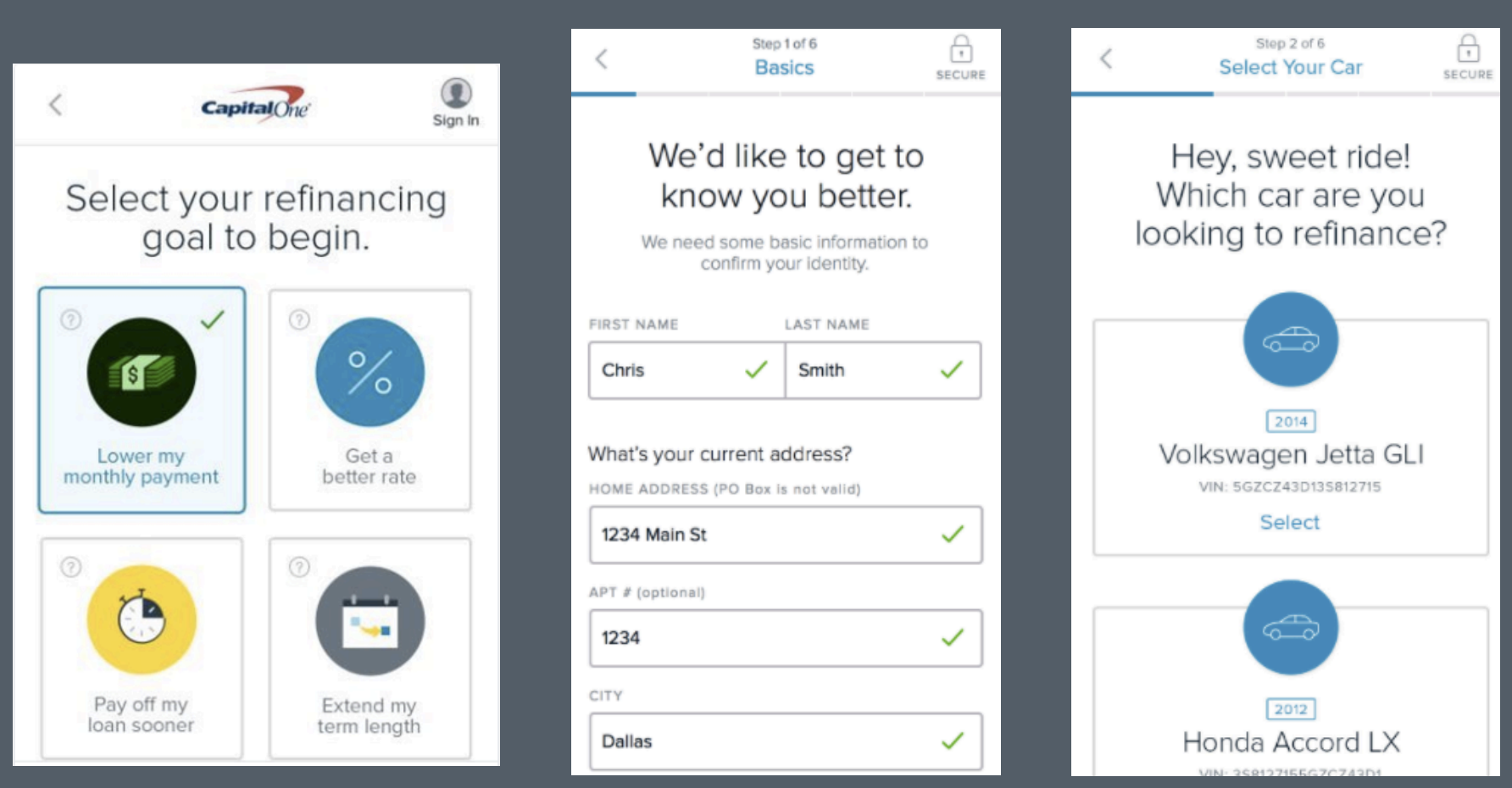
Across Capital One's auto finance suite, the challenge was the same: complex financial products wrapped in jargon-heavy, intimidating language. The work involved building conversation prototypes, co-creating content workbooks with design and product, and rewriting everything from application flows to landing pages using plain, human language.
The Approach
- Content-first design — Worked from conversation prototypes before screens were built, ensuring the language shaped the experience rather than being squeezed in at the end.
- Content workbooks — Co-created workbooks with designers and PMs defining conversation structure, ideal phrases, and navigation patterns for each flow.
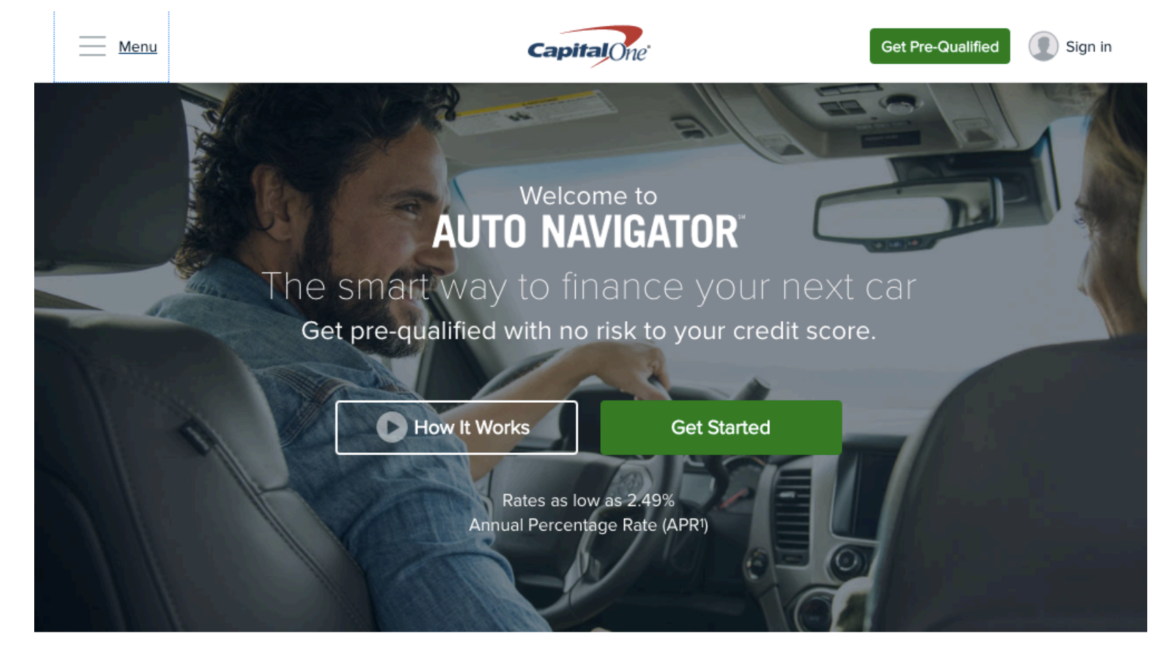
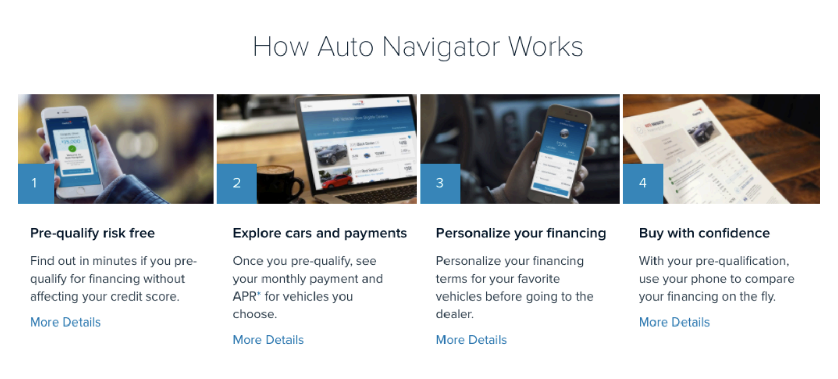
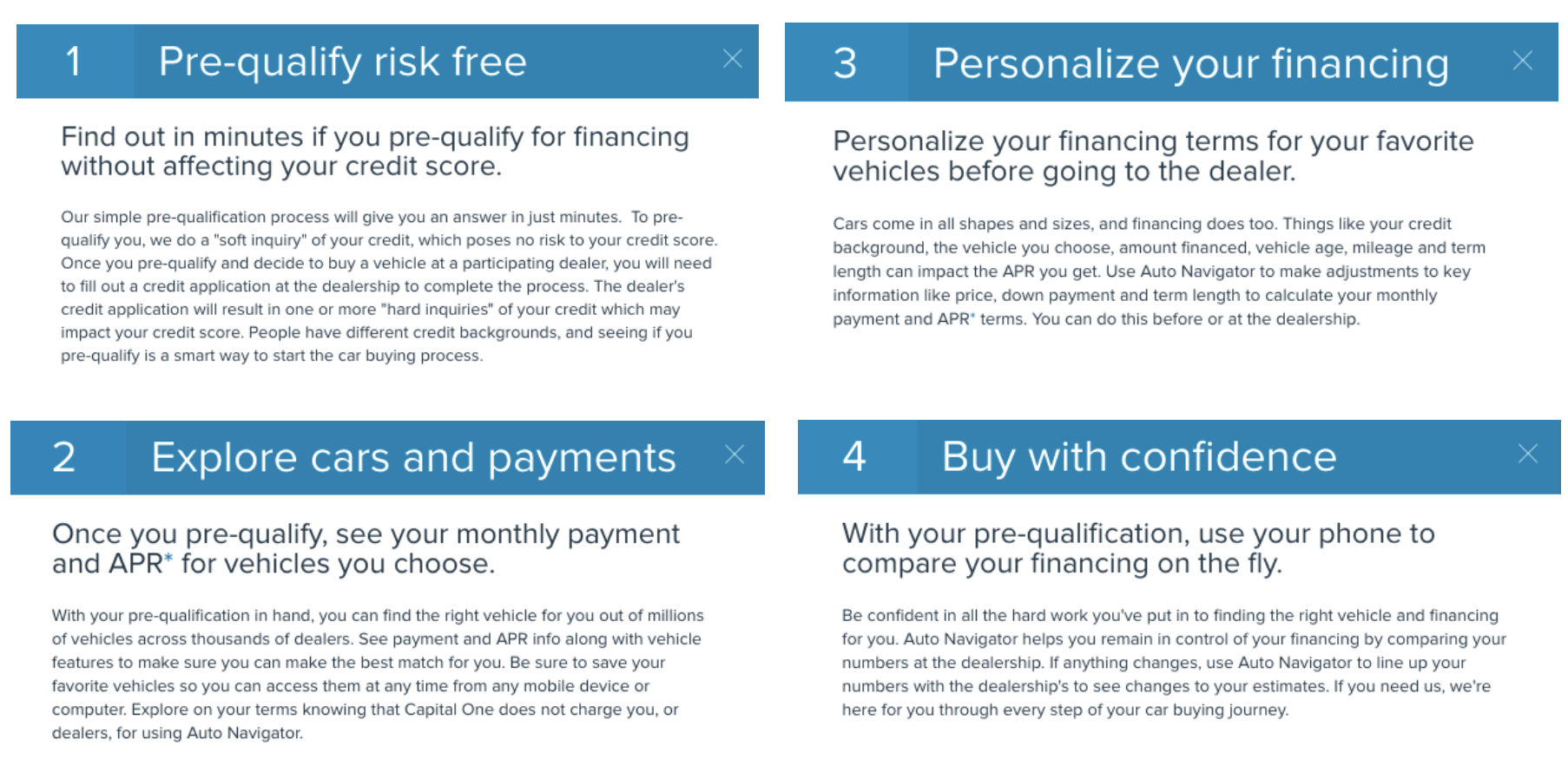
- Auto Navigator copy — Wrote and optimized landing page content for Capital One's Auto Navigator — a pre-qualification tool designed to feel low-risk and approachable for shoppers.
- Plain language rewrites — Transformed dense legal and financial copy into clear, friendly language that reflected how real customers talked about their money.